标签搜索


搜索到
36
篇与
的结果
-
 ES6 更新内容简介 JavaScript 版本号 旧的 ECMAScript 版本由数字命名:ES5 和 ES6。从 2016 年开始,版本按年份命名:ES2016、2018、2020es6(ES2015) 新增● let const 关键字● 箭头函数 const x = (x, y) => x * y;● 解构赋值 对象结构赋值const person = { firstName: "John", lastName: "Doe", age: 50, eyeColor: "blue" }; // Destructuring Assignment let { firstName, age } = person;数组结构赋值const fruits = ["Banana", "Orange", "Apple", "Mango"]; // Destructuring Assignment let [fruit1, fruit2] = fruits;● 展开运算符1 合并对象或数组2 转换数组3 对象的展开4 默认参数const q1 = ["Jan", "Feb", "Mar"]; const q2 = ["Apr", "May", "Jun"]; const q3 = ["Jul", "Aug", "Sep"]; const q4 = ["Oct", "Nov", "May"]; const year = [...q1, ...q2, ...q3, ...q4]; const numbers = [23,55,21,87,56]; let maxValue = Math.max(...numbers);. //es6 function fn(a=10){ console.log(a); } fn();● For/oflet arr = ["张三","李四","王五"]; for(let val of arr){ console.log(val);//张三 李四 王五 }● Map Objects● Set Objects ES6新增了Set结构,用于保存唯一值的序列● Classes 关键字 创建构造函数● Promises● Symbol● Default Parameters● Function Rest Parameter● String.includes() 判断是否包含某个字符,或者某个值● String.startsWith() 通过什么开始● String.endsWith() 通过什么结尾let text = "Hello world, welcome to the universe."; text.includes("world") // Returns true let text = "Hello world, welcome to the universe."; text.startsWith("Hello") // Returns true var text = "John Doe"; text.endsWith("Doe") // Returns true● Array entries() 从数组 fruit 创建一个可迭代对象, 该对象包含了数组的键值对:var fruits = ["Banana", "Orange", "Apple", "Mango"]; fruits.entries();[0, "Banana"][1, "Orange"][2, "Apple"][3, "Mango"]● Array.from() 把伪数组转换成数组● Array keys() ● Array find() 查找数组里符合条件的第一个值● Array findIndex() 查找符合条件的第一个索引值//1.Array.from() var lis = document.querySelectorAll("li"); console.log(lis);//NodeList(5) [li, li, li, li, li]伪数组 console.log( Array.from(lis));//(5) [li, li, li, li, li] //2.Array.of();创建一个数组 var res = Array.of(7,8); console.log(res);//(2) [7, 8] //3.find :查找数组里符合条件的第一个值 ar arr = [1,2,3,4,5]; var res = arr.find(function(item){ return item>3; }) console.log(res);//4 // 4.findIndex: 查找符合条件的第一个索引值 var arr = [1,2,3,4,5]; var res = arr.findIndex(item=>item>3); console.log(res);//3 //5.includes :判断是否包含某个字符,或者某个值 var arr = [1,2,3,4]; var res = arr.includes(5); console.log(res); // 6.flat : 扁平化数组 :默认是1 只会扁平化一层数组 ,如果传入指定参数 那么就会扁平化指定层数 var arr = [1,2,3,[4,[5]]]; //3维数组 //ES5 var res = arr.toString(); console.log(res); var newArr = res.split(","); console.log(newArr);//(5) ["1", "2", "3", "4", "5"] console.log( Object.prototype.toString.call(newArr));//[object Array] //ES6 var res = arr.flat(2); console.log(res);//(5) [1, 2, 3, 4, 5] console.log( Object.prototype.toString.call(res));//[object Array]● Math.trunc● Math.sign● Math.cbrt● Math.log2● Math.log10● Number.EPSILON● Number.MIN_SAFE_INTEGER● Number.MAX_SAFE_INTEGER● Number.isInteger()● Number.isSafeInteger()● New Global Methods● JavaScript ModulesES2016● JavaScript Exponentiation (**)幂操作 x ** y == Math.pow(x, y) 运算符表示幂运算,用于计算一个数的指数。例如,a b 表示将 a 的值提升到 b 次方。● JavaScript Exponentiation assignment (**=)在 JavaScript 中,= 是指数赋值运算符,用于对变量进行幂运算并将结果赋给左侧的操作数。例如,a = b 等同于 a = a ** b,表示将变量 a 的值提升到 b 次方,并将结果赋给变量 a。这个运算符通常用于简化幂运算和赋值的组合操作。● JavaScript Array includes()JavaScript 中用于检查数组中是否包含特定元素的方法。它返回一个布尔值,指示数组是否包含传入的元素。如果包含,则返回 true,否则返回 false。下面是一个简单的示例:const numbers = [1, 2, 3, 4, 5];console.log(numbers.includes(3)); // 输出 trueconsole.log(numbers.includes(6)); // 输出 falseES2017● JavaScript String padding字符串填充是一种在字符串前面或后面添加特定字符,直到字符串达到指定长度的操作。在 JavaScript 中,可以使用 padStart() 和 padEnd() 方法来实现字符串填充。● JavaScript Object entries()Object.entries() 方法返回一个给定对象中可枚举属性的键值对数组。● JavaScript Object values()Object.values() 方法返回一个给定对象自身的所有可枚举属性值的数组。● JavaScript async and awaitasync 和 await 是用于处理异步操作的 JavaScript 关键字。通过将 async 关键字放在函数声明之前,该函数就会成为一个异步函数。而使用 await 关键字,可以暂停异步函数的执行,等待 Promise 解决(resolve)之后再继续执行。● Trailing Commas in Functions在 JavaScript 函数中,在参数列表的最后一个参数后面允许添加逗号。这样做的好处是当需要添加新的参数时,只需在最后一个参数后面添加逗号,而不必调整之前的参数逗号。● JavaScript Object.getOwnPropertyDescriptorsObject.getOwnPropertyDescriptors() 方法返回一个对象的所有自有属性的描述符。这对于获取对象属性的完整信息很有用,包括属性的值、是否可写、是否可枚举等。ES2018● Asynchronous Iteration: 异步迭代是指在 JavaScript 中处理异步操作的一种方法,特别是在处理生成器函数或异步迭代器时。它使您能够使用 for-await-of 循环来迭代异步可迭代对象,以便按照顺序处理异步任务。● Promise Finally: Promise.finally() 是 Promise 的一个方法,无论 Promise 状态如何(已解决或已拒绝),都会执行相同的代码块。这对于在完成 Promise 之后需要执行清理操作或收尾工作很有用。● Object Rest Properties: 对象剩余属性语法允许将对象中未被解构的其余属性收集到一个新的对象中。这样可以轻松地提取对象的一部分属性,并将剩余的属性放入一个新对象中。● New RegExp Features: 最新的 ECMAScript 版本增加了一些正则表达式的功能,比如命名捕获组、dotAll 模式、lookbehind 等。这些功能使得正则表达式更强大且更易于使用。● JavaScript Shared Memory: 共享内存是指多个 Web Workers 之间共享数据的机制。SharedArrayBuffer 和 Atomics API 是 JavaScript 中用于实现共享内存的机制,可以让多个 Worker 之间共享数据,但需要小心处理避免出现竞争条件和安全问题。ES2019● String.trimStart(): String.trimStart() 方法从字符串的开头移除空格或其他指定字符,并返回修改后的字符串。● String.trimEnd(): String.trimEnd() 方法从字符串的末尾移除空格或其他指定字符,并返回修改后的字符串。● Object.fromEntries: Object.fromEntries() 方法接收一个包含键值对的数组,然后返回一个基于这些键值对的新对象。它的作用相当于反转 Object.entries() 方法生成的数组。● Optional catch binding: JavaScript 中的可选捕获绑定是指在使用 try...catch 语句时,可以不提供异常对象的变量名,而只使用 catch {}。这样做会导致不会创建异常对象。● Array.flat(): Array.flat() 方法用于将嵌套数组展平为一个新数组,可以选择展平的层数。这对于去除多维数组中的嵌套结构非常有用。● Array.flatMap(): Array.flatMap() 方法首先映射每个元素,然后将结果扁平化成一个新数组。类似于先使用 map() 方法,然后再使用 flat() 方法。● Revised Array.Sort(): 改进的 Array.sort() 方法是指现代浏览器中优化的排序算法,以提高性能和稳定性。● Revised JSON.stringify(): 修改后的 JSON.stringify() 方法可能包括更多参数或选项,以实现更灵活的序列化操作。● Separator symbols allowed in string literals: JavaScript 允许在字符串字面量中使用分隔符符号,例如反斜杠或换行符,以便在代码中更清晰地表示长字符串或包含特殊字符的字符串。● Revised Function.toString(): 对 Function.toString() 方法进行修订可能改善输出格式或提供更多关于函数源代码的信息。ES2020● BigInt: BigInt 是一种用来表示任意精度整数的新数据类型,在 JavaScript 中引入了 BigInt 类型,使得可以安全地存储和操作大整数值。● String matchAll(): String.matchAll() 方法返回一个包含正则表达式匹配结果的迭代器。它允许你从字符串中找到所有匹配指定模式的子字符串。● The Nullish Coalescing Operator (??): 空值合并运算符 ?? 用于判断一个值是否为 null 或 undefined。如果操作数为 null 或 undefined,它会返回其右侧的默认值。● The Optional Chaining Operator (?.): 可选链操作符 ?. 允许在不确定对象是否存在或具有某个属性的情况下,避免出现 TypeError 错误。如果左侧的操作数为 null 或 undefined,整个表达式将返回 undefined,而不会导致错误。● Logical AND Assignment Operator (&&=): 逻辑与赋值运算符 &&= 用于在条件为真时才将右侧的操作数赋给左侧的变量。● Logical OR Assignment (||=): 逻辑或赋值运算符 ||= 用于在左侧值为假时才将右侧的操作数赋给左侧的变量。● Nullish Coalescing Assignment (??=): 空值合并赋值运算符 ??= 类似于空值合并运算符 ??,但将结果赋给左侧的变量。● Promise.allSettled(): Promise.allSettled() 方法返回一个 Promise,该 Promise 在所有给定的 Promise 都已解析或拒绝后解析,并带有一个对象数组,每个对象表示相应的 Promise 结果。● Dynamic Import: 动态导入是 ES2020 的一个特性,它允许在运行时以异步方式导入模块,而不是在代码的头部静态声明。这可以帮助优化加载时间和资源使用。ES2021● Promise.any(): Promise.any() 是 Promise 的一个方法,用于接收一个 Promise 可迭代对象(例如数组),并在其中的任何一个 Promise 解决时解决,并返回一个由第一个完成的 Promise 返回值组成的 Promise。如果可迭代对象中没有任何 Promise 成功,则返回一个拒绝状态的 Promise。● String replaceAll(): String.replaceAll() 方法通过替换所有匹配的子字符串来更新原始字符串。它使用给定的正则表达式或字符串来查找并替换所有出现的匹配项。● Numeric Separators (_): 数字分隔符 _ 是 ECMAScript 2021 的新特性之一,允许在数字文字中插入下划线,以增加数字的可读性而不影响其值。这在长数字或大数值的代码中提高了可读性。ES2022● Array at(): Array.at() 是 ECMAScript 2022 中提议的一个新方法,用于获取数组中指定索引处的元素。与传统的 arr[index] 访问方式不同,Array.at() 方法在遇到无效索引时会抛出 RangeError 错误。● String at(): 目前 JavaScript 中并没有名为 String.at() 的内置方法。可能是您的输入中有误,或者要表达的概念不太清楚。● RegExp /d: 在正则表达式中,/d 不是一个有效的特殊字符或元字符。可能是一个拼写错误或误解。在正则表达式中,\d 表示匹配数字字符(0-9)。● Object.hasOwn(): 可能是一个自定义函数或方法,JavaScript 中并没有名为 Object.hasOwn() 的内置方法。通常可以使用 Object.hasOwnProperty() 来检查对象是否有自己的属性。● error.cause: 这可能是指在某些库或框架中用于获取错误原因的属性。通常,JavaScript 中的错误对象可能包含一个 cause 属性或类似的属性,用于描述导致错误的根本原因。● await import: await import 是 JavaScript 中处理动态导入模块的语法。它允许您以异步的方式导入模块,当导入完成后再继续执行后续代码。● Class field declarations: 类字段声明是 ECMAScript 2022 的新特性之一,允许在类中直接声明实例字段而无需在构造函数中初始化。这使得类定义更加简洁和直观。● Private methods and fields: 私有方法和字段是 ECMAScript 2022 中的另一个新特性,允许在类中定义私有方法和字段,这些私有成员只能在类内部访问,而在外部不可见或访问。ES2023● Array findLast(): Array.findLast() 不是 JavaScript 中的内置方法。可能是您自定义的函数或库中的方法来查找数组中最后一个满足条件的元素。● Array findLastIndex(): 同样,Array.findLastIndex() 也不是 JavaScript 中的内置方法。这个方法可能用于自定义实现中,在数组中查找最后一个满足条件的元素的索引。● Array toReversed(): Array.toReversed() 也不是 JavaScript 中的标准方法。通常,要将数组反转,可以使用 Array.reverse() 方法。● Array toSorted(): Array.toSorted() 同样并非 JavaScript 标准方法。若要对数组进行排序,应该使用 Array.sort() 方法。● Array toSpliced(): Array.toSpliced() 也不是 JavaScript 中的内置方法。如果想在数组中插入、删除或替换元素,可以使用 Array.splice() 方法。● Array with(): Array.with() 似乎不符合 JavaScript 中的标准语法或内置方法。如有需要,可以提供更多上下文信息来进一步帮助澄清。● #! (Shebang): 在 Unix 和类 Unix 系统(例如 Linux)中,#!(shebang)是一个特殊字符序列,用于指定解释器程序的路径,以便运行脚本文件。在 JavaScript 中,这种写法通常在 Node.js 脚本的开头用于指定脚本的解释器路径。
 -
网页自定义Audio标签样式 audio 标签属性src:指定音频文件的URL。可以是本地文件路径或远程URL。autoplay:表示音频是否自动播放。如果设置这个属性,音频会在页面加载完成后立即开始播放。controls:显示浏览器内置的音频控件,如播放/暂停按钮、音量控制等。 controlsList="nodownload noplaybackrate" nodownload 不显示下载按钮 nofullscreen: 不要全屏按钮 noplaybackrate 不要播放速度按钮 noremoteplayback: 不要远程回放 disablePictureInPicture 禁止画中画按钮loop:指定音频是否循环播放。preload:指定音频在页面加载时的预加载行为。可选值有:none:不进行预加载。metadata:仅加载音频的元数据(比如时长、编码等)。auto:自动选择最合适的预加载方式。muted:表示音频是否静音。如果设置为true,音频将被静音。volume:指定音频的音量大小。取值范围为0.0到1.0之间。<div class="modal-audio"> <div v-if="audioSource" class="aiAudio-box"> <audio ref="audioPlayer" id="aiAudio" controls :muted="!isMuted" controlsList="nodownload noplaybackrate" @canplay="changeAudio($event,'allTime')" @timeupdate="changeAudio($event,'getCurrentTime')"> <source :src="audioSource" type="audio/mpeg"> </audio> <!-- 自定义 播放暂停 --> <span class="play-button" v-if="!isPlaying" @click="pauseAudio"></span> <span class="pause-button" v-else @click="playAudio"></span> <!-- 自定义 音量 静音 --> <span class="volume-button" v-if="isMuted" @click="toggleMute"></span> <span class="mute-button" v-else @click="toggleMute"></span> <!-- 自定义 时间 --> <span class="audio-time"> <!-- {{ currentTimeLabel + ' / ' + allTimeLabel }} --> </span> <!-- 自定义 进度条 --> <input type="range" class="audio-range" ref="audioPlayInput" step="0.01" :max="allTime" :value="currentTime" @change="changeAudio($event,'changeCurrentTime')" /> </div> </div>.modal-audio { padding: 20px 20px 0; display: flex; justify-content: center; .aiAudio-box { position: relative; #aiAudio { height: 50px; border: 1px solid #b292f4; border-radius: 40px; object-fit: initial; } .play-button, .pause-button { position: absolute; left: 13px; top: 11px; display: inline-block; width: 28px; height: 28px; background-size: cover; } .play-button { background-image: url("https://shthah.cn/audio/play.webp"); } .pause-button { background-image: url("https://shthah.cn/audio/pause.webp"); } .volume-button, .mute-button { position: absolute; left: 255px; top: 11px; display: inline-block; width: 28px; height: 28px; background-size: cover; } .volume-button { background-image: url("https://shthah.cn/audio/volume.webp"); } .mute-button { background-image: url("https://shthah.cn/audio/mute.webp"); } .audio-time { position: absolute; top: 14px; left: 48px; color: #454545; } .audio-range { position: absolute; top: 22px; left: 133px; width: 110px; } input[type="range"].audio-range { outline: none; -webkit-appearance: none; /*清除系统默认样式*/ background: -webkit-linear-gradient(#b292f4, #b292f4) no-repeat, rgba(0, 0, 0, 0.19); background-size: 0% 100%; /*设置左右宽度比例*/ height: 5px; border-radius: 5px; } /*拖动块的样式*/ input[type="range"]::-webkit-slider-thumb { -webkit-appearance: none; /*清除系统默认样式*/ height: 13px; width: 13px; background: #b292f4; border-radius: 50%; border: solid 1.5px #fff; } } audio::-webkit-media-controls-timeline-container, audio::-webkit-media-controls-seek-back-button, audio::-webkit-media-controls-seek-forward-button { background-color: #555; } // 整个音频控制面板的容器 audio::-webkit-media-controls-panel { background: #fcfbff; } // 静音按钮 audio::-webkit-media-controls-mute-button { background-image: none; } // 播放按钮 暂停 audio::-webkit-media-controls-play-button { background-image: none; } audio::-webkit-media-controls-pause-button { background-image: none; } // 包含时间轴的容器 audio::-webkit-media-controls-timeline-container { background-color: #b292f4; } // 当前播放时间显示 剩余播放时间显示 时间轴 audio::-webkit-media-controls-current-time-display, audio::-webkit-media-controls-time-remaining-display, audio::-webkit-media-controls-timeline { display: none; } }
-
-
vue3之Composition API Composition API也叫组合式API,是Vue3.x的新特性。通过创建 Vue 组件,我们可以将接口的可重复部分及其功能提取到可重用的代码段中。仅此一项就可以使我们的应用程序在可维护性和灵活性方面走得更远。然而,我们的经验已经证明,光靠这一点可能是不够的,尤其是当你的应用程序变得非常大的时候——想想几百个组件。在处理如此大的应用程序时,共享和重用代码变得尤为重要创建一个可组合函数创建一个简单的可组合函数。下面count是具有无功值的组件的示例。使用Composition API的计数器示例<script setup> import { ref } from "vue"; const count = ref(0); const increment = () => { count.value++; }; </script> <template> <button @click="increment"> Clicked {{ count }} times </button> </template>Options API 表示法主要在 Vue 2 之前使用,它不允许您从组件中提取状态。然而,随着 Composition API 的出现,现在可以将状态提取到外部函数。这允许跨多个组件重用逻辑。以下可组合函数是使用 Composition API将上述组件提取到外部useCounter()的示例。useCounter.ts import { ref } from "vue"; export const useCounter = () => { const count = ref(0); const increment = () => { count.value++; }; return { count, increment, }; };组件可以调用和使用它们。APP.vue <script setup> import { useCounter } from "./useCounter"; const { count, increment } = useCounter(); </script>useCounter()通过创建 ,不仅简化了组件内部的描述,而且好处是可以在其他组件中重用相同的逻辑。通常,每次需要时都必须创建这样的可组合函数,但人们已经意识到存在经常使用的可组合函数。
-
CSS背景边框滚动效果 通过圆锥渐变设置背景,再控制背景旋转 <div class="container"> <a class="card-bg" href="#"></a> <a class="card" href="#"></a> </div>// 自定义渐变角度属性 @property --gradient-angle { syntax: "<angle>"; initial-value: 0turn; inherits: false; } .card { animation: 2s gradient-angle infinite linear; border: 2px solid transparent; background-image: linear-gradient(#584827, #2d230f), conic-gradient( from var(--gradient-angle), #584827 0%, #c7a03c 37%, #f9de90 30%, #c7a03c 33%, #584827 40%, #584827 50%, #c7a03c 77%, #f9de90 80%, #c7a03c 83%, #584827 90% ); background-clip: padding-box, border-box; background-origin: padding-box, border-box; } .card-bg { animation: 2s gradient-angle infinite linear; border: 2px solid transparent; background-image: conic-gradient( from var(--gradient-angle), #584827 0%, #c7a03c 37%, #f9de90 30%, #c7a03c 33%, #584827 40%, #584827 50%, #c7a03c 77%, #f9de90 80%, #c7a03c 83%, #584827 90% ); background-clip: border-box; background-origin: border-box; } @keyframes gradient-angle { to { --gradient-angle: 1turn; } } html, body { background: #141819; } .container { display: flex; justify-content: center; } .card,.card-bg { display: grid; min-width: 200px; margin:20px; padding: 20px; color: currentColor; border-radius: 20px; aspect-ratio: 1/1; }@property@property 是一个 CSS Houdini API,它允许开发人员定义自定义 CSS 属性。在你的例子中, --gradient-angle 可能是你想要定义的一个自定义渐变角度属性。通过使用 @property,你可以为这个属性指定类型、初始值等信息。你可以尝试下面这样定义 --gradient-angle 自定义属性:@property --gradient-angle { syntax: "<angle>"; inherits: false; initial-value: 0deg; }在这个示例中,我们定义了 --gradient-angle 的语法为 (表示一个角度值),不继承父元素的值,并且初始值为 0deg。在 CSS 中,@property 规则中的 syntax 值用于定义属性值的语法规则。以下是一些常见的 syntax 值::表示长度值,比如 px, em, rem 等。:表示百分比值,比如 50%, 100% 等。:表示颜色值,比如 red, #00ff00, rgba(255, 0, 0, 0.5) 等。:表示角度值,比如 0deg, 90deg, 180deg 等。:表示数字值,可以带小数点,比如 1, 2.5, -10.75 等。:表示字符串值,需要用引号括起来,比如 "Hello", 'World' 等。:表示 URL 值,比如 url('example.com/image.jpg').:表示自定义标识符(identifier),通常用于自定义属性名称。
-
CSS 动画-渐变段落-按钮边框 渐变段落<div style="background:#000"> <p class="text-flowLight"> 我是一段文字,看看看我的效果 </p> </div>.text-flowLight { position:relative; background-image:-webkit-linear-gradient(left,#1A3375,#b2c8ff,#1A3375 100%); -webkit-text-fill-color:transparent; -webkit-background-clip:text; -webkit-background-size:200% 100%; -webkit-animation:masked-animation 5s forwards linear infinite; font-weight:700; white-space:nowrap } @keyframes masked-animation { from { background-position:0 0 } to { background-position:-200% 0 } }按钮边框<div class="rabut"> <a href="###">炫酷边框特效</a> </div>body { background-color: black; } .rabut { width: 200px; height: 50px; color: #69ca62; /* 外面围绕的边框是真边框,眼睛看见的边框是阴影效果 */ box-shadow: inset 0 0 0 1px rgba(105, 202, 98, 0.5); background-color: #0f222b; } .rabut { text-align: center; margin: 100px auto; } .rabut, .rabut::before, .rabut::after { position: absolute; top: 0; bottom: 0; left: 0; right: 0; } .rabut::before, .rabut::after { content: ""; margin: -5%; box-shadow: inset 0 0 0 2px; animation: clipMe 8s linear infinite; } .rabut::before { animation-delay: -4s; } .rabut:hover::after, .rabut:hover::before { background-color: rgba(255, 0, 0, 0.3); } /* 核心:更改宽高后这下面的动画效果也需修改 */ @keyframes clipMe { 0%, 100% { /* 上 右 下 左*/ /* 上-下=-2px,右-右=220px 显示盒子上边框 */ clip: rect(0px, 220px, 2px, 0px); } 25% { /* 上-下=-70px,右-右=2px 显示盒子左边框 */ clip: rect(0px, 2px, 70px, 0px); } 50% { /* 上-下=-2px,右-右=220px 显示盒子下边框 */ clip: rect(68px, 220px, 70px, 0px); } 75% { /* 上-下=-70px,右-右=2px 显示盒子右边框 */ clip: rect(0px, 220px, 70px, 218px); } } .rabut a { font-size: 20px; line-height: 50px; text-decoration: none; color: #404d5b; }
-
CSS 实现漂亮的鼠标悬停效果 CSS Filter 是一种 CSS 功能,可让您获得模糊和颜色调整等图形效果只需指定您要应用的CSS属性filter的类型。例如,如果指定以下内容,则 HTML 元素将显示应用的效果。使用亮度的表现brightness()我们使用亮度调节方法。要使鼠标悬停在照片上时显得更亮,:hover只需为正常时间和时间设置不同的滤镜值,并使用 CSS Transition 添加动画即可。.effect-brightness { transition: filter 0.3s ease; filter: brightness( 1 ); /* 因为是默认值,所以可以省略这一行 */ } .effect-brightness:hover { filter: brightness(1.75); /* 添加亮度 */ }使用亮度的表现(闪烁)您只需更改 CSS 过渡即可创建各种变体。通过添加将鼠标悬停在其上方时瞬间闪烁的表情,可以给人一种轻快运动的印象。通过添加边框,可以给人留下鲜明的印象。transition生产的技巧是为正常时间和悬停时间指定不同的属性。.effect-flash { border: 1px solid rgba(255, 255, 255, 0%); filter: brightness(1.0); transition: filter 1s, border-color 1s ; } .effect-flash:hover { border: 1px solid rgba(255, 255, 255, 100%); transition: border-color 0.2s; animation: bright-flash 0.2s linear forwards; /* CSS Animation 动画。最后维持最终态 */ } @keyframes bright-flash { 0% { filter: brightness(2.5); } 100% { filter: brightness(1.25); } }使用饱和度一种将正常状态设置为单色并在鼠标悬停时取消单色的技术。通过将其设为单色,您可以用它来表达整体优雅的设计。这种表达对于化妆品和服装等品牌广告网站非常有用。.effect-mono { filter: grayscale(100); transition: filter 0.2s; } .effect-mono:hover { filter: grayscale(0); }使用亮度的表现(最适合按钮)brightness()此表达式非常适合具有多态设计的按钮。光滑的设计与亮度的变化相得益彰,单个按钮图像营造出漂亮的效果。即使设计者只提供普通的按钮图像,它也很有用,因为它很容易设置。.btn { filter: brightness(1); transition: filter 0.3s; } .btn:hover { filter: brightness(1.15); } .btn:active { filter: brightness(0.85); }使用模糊的表现一种当鼠标悬停时显示附加信息的技术。.effect-blur-thumb { transition: all 0.3s ease; width: 100%; } .effect-blur:hover .effect-blur-thumb { /* 悬停时调整亮度 */ filter: blur(8px) brightness(1.5); transform: scale(1.1); }
-
Promise.all promise.all中所有的请求成功了,走.then(),在.then()中能得到一个数组,数组中是每个请求resolve抛出的结果。promise.all中只要有一个失败了,走.catch(),在.catch()中获取第一个失败请求rejected抛出的结果。在 Promise.all 中,如果其中任何一个 Promise 被 rejected 或抛出异常,则整个 Promise.all 将会立即被 reject,而不会等到其他 Promise 完成。具体地说,一旦一个 Promise 失败,Promise.all 就会中止并返回一个新的拒绝状态的 Promise。然后**,其他未完成的 Promise 将会继续运行,但是它们的结果将会被忽略,不会进一步处理。等待多个 Promise创建一些模拟任务并逐一等待它们:const tasks = [ { id: 'A', durationMs: 2000, fulfills: true }, { id: 'B', durationMs: 3000, fulfills: true }, { id: 'C', durationMs: 1000, fulfills: true }, ]; try { for (const task of tasks) { await doTask(task); } console.log('success'); } catch (e) { console.log('failure'); }输出:Promise A: fulfilled ✅约 2 秒后 ( t=2)。Promise B: fulfilled ✅约 3 秒后 ( t=5)。Promise C: fulfilled ✅约 1 秒后 ( t=6)。这段代码可以运行,但速度很慢,因为它在循环的每次迭代中一次构造一个 Promise for-of,因此未来的 Promise 只有在之前的 Promise 都已实现后才会构造。如果第一个 Promise 需要很长时间才能实现,但未来的 Promise 需要的时间较少,我们最终会浪费时间,因为我们本可以安排那些更快的 Promise 回调更早运行。事实上,在实际实现中,doTask可能会向服务器发出网络请求。使用我们当前的方法,这意味着我们一次发出一个网络请求,这不必要地慢,因为浏览器支持并发网络请求。同步构建 Promise提前构建所有 Promise 然后等待它们会更有效率。这样,如果 Promise 执行器函数发出网络请求,这些请求可以由运行时并发处理。const tasks = [ { id: 'A', durationMs: 2000, fulfills: true }, { id: 'B', durationMs: 3000, fulfills: true }, { id: 'C', durationMs: 1000, fulfills: true }, ]; try { const promises = tasks.map((task) => doTask(task)); for (const promise of promises) { await promise; } console.log('success'); } catch (e) { console.log('failure'); }在此示例中,我们将每个任务映射到 的结果doTask,该结果返回一个 Promise。因此,我们得到了一个待定 Promises 数组:[Promise {<pending>}, ..., Promise {<pending>}]这一次,如果doTask浏览器发出网络请求,它可以发出多个并发请求,因为我们提前构造了所有 Promises。我们仍然会按照构造顺序一次等待一个 Promises,但不同之处在于其他网络请求可以在后台处理,而无需我们等待。如果任何单个 Promise 拒绝,上述代码实际上会抛出未捕获的错误解决方案:Promise.allPromise.all接受一个 Promise 的可迭代对象并返回一个新的外部 Promise,一旦所有单个 Promise 都已实现,该外部 Promise 便会实现,而一旦单个 Promise 拒绝,该外部 Promise 便会拒绝。此外,如果Promise.all实现,它会使用所有单个已实现值的数组来实现。try { const values = await Promise.all([p1, p2, ..., pn]); console.log('All promises fulfilled', values); } catch (e) { console.log('A promise rejected'); }Promise.all这比一次等待一个 Promises 更快,因为在调用时 Promises 已经构造好了。const tasks = [ { id: 'A', durationMs: 2000, fulfills: true }, { id: 'B', durationMs: 3000, fulfills: true }, { id: 'C', durationMs: 1000, fulfills: true }, ]; try { await Promise.all(tasks.map((task) => doTask(task))); console.log('Promise.all fulfilled'); } catch (e) { console.log('Promise.all rejected'); }如果 Promise 执行器函数doTask发起网络请求,我们可以看到性能的大幅提升,因为一旦构建了 Promise,浏览器就会同时执行这些网络请求。相比之下,在我们的第一个for-of循环方法中,我们必须在循环的每次迭代中一次发出一个网络请求。如果第一个请求需要很长时间才能解决,那么后续可能在很长一段时间内都不会被创建。但是,不要误Promise.all以为这是真正的并行;Promise回调仍会在事件循环中一次排队一个,并且永远不会同时运行。队列总是一次弹出一个项目,事件循环每次只运行一件事。失败状态const tasks = [ { id: 'A', durationMs: 2000, fulfills: true }, { id: 'B', durationMs: 3000, fulfills: true }, { id: 'C', durationMs: 1000, fulfills: false }, // rejects ]; try { await Promise.all(tasks.map((task) => doTask(task))); console.log('Promise.all fulfilled'); } catch (e) { console.log('Promise.all rejected'); } Promise C: rejected ❌ Promise.all rejected Promise A: fulfilled ✅ Promise B: fulfilled ✅请注意 Promise C 会提前拒绝,因为我们不会等待其他 Promise 解决后再构造并等待它。但更重要的是,Promise.all根据规范,Promise C 拒绝后会立即拒绝。这很棒,因为这意味着我们不必等待其余 Promise 解决 - 只要一个 Promise 拒绝,我们就可以立即开始处理错误情况。此行为称为快速失败。Promise.all不会立即取消Promise.all剩余的待处理 Promise。因此,剩余的 Promise 回调仍然会在事件循环中排队,并在轮到它们时运行。因此,即使在 Promise C 被拒绝后被拒绝,Promise A 和 B 仍然有机会解决。只是我们不必等待其他Promise 解决后再拒绝外部 Promise,这使我们能够更快地处理拒绝。如果 Promise A 或 Promise B 在被拒绝后又被拒绝,会发生什么情况Promise.all?从技术上讲,它们只会拒绝Promise.all已经被拒绝的 Promise。而拒绝已解决的 Promise 不会产生任何效果。
-
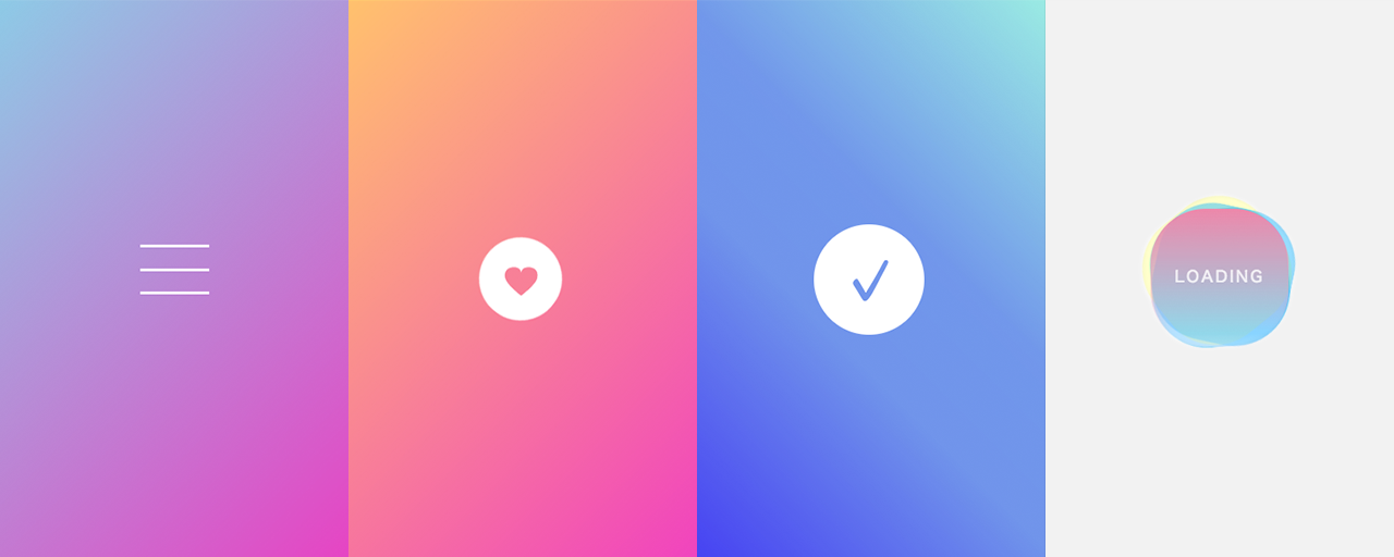
CSS动画实现 “关闭”的变形动画{collapse}{collapse-item label="代码实现" } .container-bg { background-image: linear-gradient(135deg, #8ecbe6, #e743c3); } .hm-line-top, .hm-line-middle, .hm-line-bottom { --height: 3px; display: block; width: 100%; height: var(--height); transition: 0.3s; transform-origin: center; background-color: #fff; position: absolute; top: calc(50% - var(--height) / 2); left: 0; } .hm-line-top { translate: 0 14px; } .hm-line-bottom { translate: 0 -14px; } .hm-button { position: relative; display: inline-flex; width: 48px; height: 48px; appearance: none; background: none; border: none; cursor: pointer; &.active { .hm-line-middle { opacity: 0; rotate: 90deg; } .hm-line-top { translate: 0 0; rotate: -135deg; } .hm-line-bottom { translate: 0 0; rotate: 135deg; } } } <div class="container container-bg"> <button class="hm-button" aria-label="开启"> <span class="hm-line-top"></span> <span class="hm-line-middle"></span> <span class="hm-line-bottom"></span> </button> </div> const button = document.querySelector(".hm-button"); button.addEventListener("click", () => { const current = button.classList.contains("active"); const next = !current; button.classList.toggle("active", next); button.setAttribute("aria-label", next ? "关闭" : "开启"); });{/collapse-item}{/collapse}圆形按钮悬停动画中心有图标的圆形按钮的悬停动画。心形随着旋转而改变颜色,背景圆圈变为透明的旋转虚线。{collapse}{collapse-item label="代码实现" } .content-bg-heart { background-image: linear-gradient(135deg, #ffc46e, #f043bf 100%); } .heart-button { position: relative; display: grid; width: 90px; height: 90px; cursor: pointer; place-items: center; appearance: none; border: none; background: none; user-select: none; &:hover { .heart-button-label { color: #fff; transform: rotate3d(0, 0, 0, 180deg) scale(1.2, 0.9); } .heart-button-back-inner { border: 1px dashed #fff; background-color: rgb(255 255 255 / 0); transform: scale(1.5); } } } .heart-button-label { position: relative; color: #f78198; font-size: 3rem; transform: scaleY(0.8); transition: 0.35s ease-in-out; line-height: 1; } .heart-button-back { position: absolute; width: 100%; height: 100%; animation: rotation 4s infinite linear; } .heart-button-back-inner { position: absolute; border: 2px solid #fff; width: 100%; height: 100%; border-radius: 50%; background-color: #fff; transition: 0.2s ease; top: 0; left: 0; box-sizing: border-box; } @keyframes rotation { from { transform: rotate(0deg); } to { transform: rotate(360deg); } } <section class="container content-bg-heart"> <button class="heart-button" > <span class="heart-button-back"> <span class="heart-button-back-inner"></span> </span> <span class="heart-button-label"></span> </button> </section>{/collapse-item}{/collapse}复选标记动画{collapse}{collapse-item label="代码实现"} .content-bg-check { background-image: linear-gradient( -135deg, #9cece3 0%, #7496ea 40%, #7393ea 60%, #4b3cf2 100% ); } .circle { position: relative; border-radius: 50%; width: 80px; height: 80px; box-shadow: inset 0 0 0 2px #fff; --ease-in-expo: cubic-bezier(0.95, 0.05, 0.795, 0.035); --ease-out-expo: cubic-bezier(0.19, 1, 0.22, 1); --circle-bg-color: #7393ea; &.animation { animation: circle-filling-animation 0.3s ease 1.2s forwards; .circle-cover-1::before { animation: circle-draw-animation 0.4s var(--ease-in-expo) 0.4s forwards; } .circle-cover-2::before { animation: circle-draw-animation 0.4s var(--ease-out-expo) 0.8s forwards; } .circle-illust { animation: circle-check-animation 0.9s 1.4s forwards; animation-timing-function: linear( 0, 1.32, 0.87, 1.05, 0.98, 1.01, 1, 1 ); } } } .circle-cover-1, .circle-cover-2 { position: absolute; overflow: hidden; width: 50%; height: 100%; &::before, &::before { position: absolute; content: ""; } } .circle-cover-1 { left: 50%; &:before { width: 100%; height: 200%; background: var(--circle-bg-color); transform-origin: 0 25%; } } .circle-cover-2::before { left: -10%; width: 110%; height: 120%; background: var(--circle-bg-color); transform-origin: 100% 40%; } .circle-illust { --size: 64px; position: absolute; width: var(--size); height: var(--size); color: var(--circle-bg-color); top: calc(50% - var(--size) / 2); left: calc(50% - var(--size) / 2); transform-origin: 50% 50%; opacity: 0; svg { width: 100%; height: 100%; } } @keyframes circle-draw-animation { 0% { transform: rotate(0deg); } 100% { transform: rotate(180deg); } } @keyframes circle-filling-animation { 0% { box-shadow: inset 0 0 0 9px #ffffff; } 100% { box-shadow: inset 0 0 0 50px #ffffff; } } @keyframes circle-check-animation { 0% { transform: scale(0) rotate(-10deg); opacity: 0; } 100% { transform: scale(1) rotate(0deg); opacity: 1; } } <div class="container content-bg-check"> <div class="circle animation"> <span class="circle-cover-1"></span> <span class="circle-cover-2"></span> <span class="circle-illust"> <svg viewBox="0 0 24 24" fill="none"> <path d="M9 16.2L4.8 12L3.4 13.4L9 19L21 7L19.6 5.6L9 16.2Z" fill="currentColor" /> </svg> </span> </div> </div> setInterval(() => { const el = document.querySelector(".circle"); el.classList.remove("animation"); setTimeout(() => { el.classList.add("animation"); }, 16); }, 4000);{/collapse-item}{/collapse}摇晃加载图标{collapse}{collapse-item label="代码实现" } .container-bg-loading { background-color: #f9f9f9; box-shadow: inset 0 0 0 1px #ddd; } .loading { position: relative; width: 100px; height: 100px; user-select: none; } .loading::after { border-radius: 40%; content: ""; display: block; width: 100%; height: 100%; background: linear-gradient( to bottom, #ee88aa, rgb(250 238 255 / 0.3) 90%, rgb(230 238 255 / 0.5) ); animation: loading-circle-opacity 3s infinite linear; } .loading-circle-1, .loading-circle-2, .loading-circle-3 { opacity: 0.4; position: absolute; background: #0af; /* 水色 */ width: 100px; height: 100px; transform-origin: 50% 47%; border-radius: 40%; animation: loading-circle-rotation 3s infinite linear; } .loading-circle-2 { opacity: 0.2; background: #ff0; /* 黄色 */ animation: loading-circle-rotation 5s infinite linear; } .loading-circle-3 { animation: loading-circle-rotation 2.5s infinite linear; } .loading-label { position: absolute; top: 33px; width: 100%; z-index: 1; color: #fff; text-align: center; font-size: 0.7rem; line-height: 2rem; letter-spacing: 0.15em; animation: loading-label-opacity 300ms infinite linear; } @keyframes loading-circle-rotation { from { rotate: 0deg; } to { rotate: 360deg; } } @keyframes loading-circle-opacity { 0% { opacity: 1; } 50% { opacity: 0.7; } } @keyframes loading-label-opacity { 0% { opacity: 1; } 25% { opacity: 0.8; } 50% { opacity: 0.9; } 75% { opacity: 0.6; } }<div class="container container-bg-loading"> <div class="loading"> <span class="loading-label">LOADING</span> <span class="loading-circle-1"></span> <span class="loading-circle-2"></span> <span class="loading-circle-3"></span> </div> </div>{/collapse-item}{/collapse}
-
btn 抖动问题 button将span一个元素放入其中并使用button: hover进行动画处理span。button哈:只是用来接hover的假人,主体处于span一个状态。但是,如果只使用: hover ,则当鼠标指针移动 到button动画后span的位置(范围外)时,它会返回,所以:hover 也必须定义。<html><body> <div class="wrap"> <button><span class="type-1">按钮1</span></button> <button><span class="type-2">按钮2</span></button> <button><span class="type-3">按钮3</span></button> </div> </body></html>*, *:before, *:after { box-sizing: border-box; margin: 0; padding: 0; border: 0; background: transparent; } html, body { width: 100%; height: 100%; } .wrap { display: flex; height: 100%; justify-content: center; align-items: center; flex-wrap: wrap; } button { margin: 1em; cursor: pointer; outline: none; font-size: 2em; } button span { display: block; padding: .5em 2em; border-radius: 5px; transition: 500ms; } .type-1 { background: #222; color: #fff; } .type-1:hover, button:hover .type-1, button:focus .type-1 { transform: translateY(-1em); } .type-2 { background: #222; color: #fff; } .type-2:hover, button:hover .type-2, button:focus .type-2 { transform: rotateZ(20deg); } .type-3 { background: #222; color: #fff; } .type-3:hover, button:hover .type-3, button:focus .type-3 { transform: scale(.8); }